Case study · 2026
Harbor & Co.
A calmer coffee brand for the everyday ritual.
The challenge
Harbor & Co. had a loyal local following and a product people talked about. But the brand had grown in pieces: a logo here, a label there, an online store that felt like an afterthought. They wanted to grow beyond the farmers' market without losing the warmth that made them worth finding.
The approach
We started with a positioning workshop and a simple question: what are people actually buying? The answer was not coffee. It was a moment of calm in the middle of the day. That became the idea behind the new identity — the daily harbor.
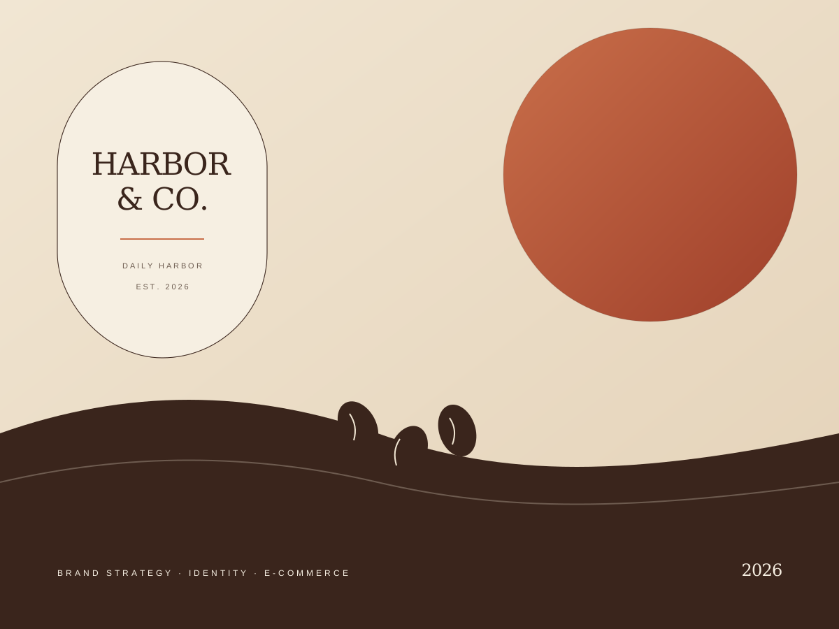
We built a flexible wordmark, a warm palette drawn from unglazed ceramic and morning light, and a packaging system that feels at home on a shelf or in a kitchen. The new storefront keeps the subscription flow short and the product pages quiet.
The outcome
The new brand launched in spring 2026 across packaging, the storefront and the market stall. The team now has a system they can extend without us, which was always the point.
“Lumen Cliff didn't just redesign our packaging. They helped us understand what we're actually selling.”
Maya Chen, Founder, Harbor & Co.